text-rendering: optimizeLegibility is Decadent and Depraved
Posted by Mat "Wilto" Marquis
Look, I like good typography as much as the next person—maybe even a little more. When a CSS property came along with promises to doctor all my type with ligatures and carefully calculated kerning—not some half-assed tracking, but real kerning—I jumped at it. I put text-rendering: optimizeLegibility on headings, body copy, navigation links; I slapped it on images just in case a ligature might appear in the background of a photograph, blurred, like an aesthetically satisfying poltergeist.
Truly, these were my web typography salad days; an era of copy littered with fi and fft and—be still my heart—st ligatures. The letters of “water” were themselves kerned water-tight, and I looked desperately for reasons to type “AVAST” in all caps, as if to spite the jankily-kerned word I once knew.

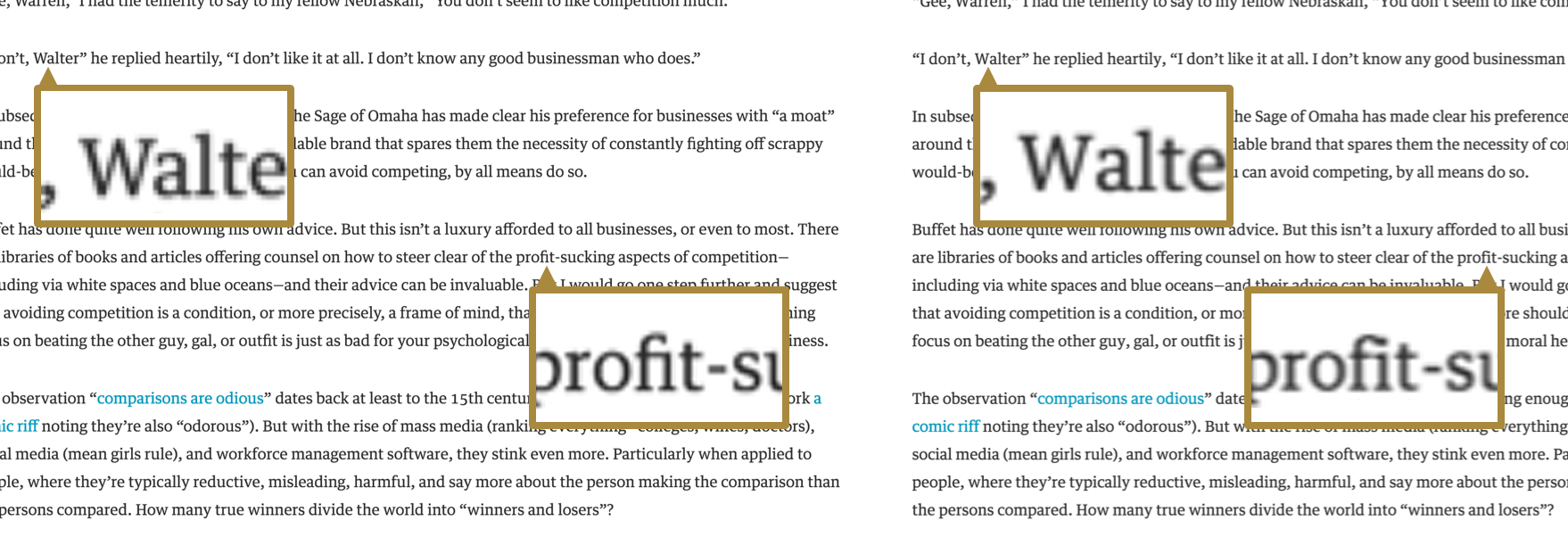
The differences between text-rendering: optimizeLegibility (left) and text-rendering: auto (right) are subtle, even for the keenly design-eyed.
In the back of my mind, though, I knew these newfound wings were made of wax. All this typographic power came with a cost: text-rendering: optimizeLegibility is slow—and by “slow,” I mean that it can bog down an entire page, from initial render time to repaints. More than that, though, it’s buggy: Android in particular has serious issues trying to render a page that uses optimizeLegibility heavily, especially the older versions that are still, sadly, very common today.
The bugs may not make much sense, but the speed issues do. There could be thousands of tiny calculations involved in kerning a long run of text, and that puts a heavy strain on a device’s processor. In a modern desktop browser like Chrome, well, it isn’t great, and on an underpowered mobile device it’s a nightmare—especially when @font-face is in play. All the work that goes into optimizeLegibility has to take place before type can be rendered at all, meaning a drastically prolonged Flash of Invisible Text or a prolonged Flash of Fallback Text, depending on the method used to load them.

WebPageTest.org’s timeline view, using a throttled connection. The only difference between these two pages is p { text-rendering: optimizeLegibility; } and p { text-rendering: optimizeSpeed; }
The key, as you might expect, is moderation. Enabling these features on the occasional subhed won’t do any serious performance harm; not noticable harm, anyway.
In fact, the default setting of text-rendering: auto doesn’t always leave us completely sans ligatures—pun intended—or with character spacings you could drive a truck through. In Firefox (and possibly WebKit and Blink, eventually), any type with a font-size of 20px or above is opted into optimizeLegibility’s features. On type that large the effects are much more noticeable, and a few short runs of text aren’t apt to hurt our performance in any measurable way.
Of course, if we want to opt out of these features entirely, there’s always text-rendering: optimizeSpeed, which does away with optimizeLegibility’s features—and costs—entirely, no matter the type size. I’m almost always willing to defer to the browser by keeping the default text-rendering: auto intact, but if you find yourself working on a page with a healthy amount of text with a font-size larger than 20px, you may want to finesse things a little with text-rendering: optimizeSpeed.